I was extremely grateful to observe last week's Exit12 rehearsal for Virtual Arts TV's Live-Streamed Performing Arts Festival.
I enjoyed that the work expands a notable amount of time (at least half an hour, easily 45 minutes with the video footage), and that each section highlights a different aspect of wartime life with ample weight. The music and readings enhance the performance by deepening the content. Lastly, the prevalence of ballet was both surprising and fantastic, inadvertently (or perhaps purposefully) exhibiting the dichotomy of standardized canons with modern philosophies and emotions, also reflected in the content itself.
The Q&A with Artistic Director Roman Baca proved very insightful. He spoke about the collaboration with the Camera Operating Director, and his trust in her decisions about which camera will be streamed at which time, noting that very little choreographic decisions were based on the placement of the cameras or timing of the streaming footage. I was honestly surprised that he took such a back seat in this process. I am not saying that he should dictate every single shot, but I do think he is not tapping into the full potential of working with the cameras. Throughout the substantial time of the performance, I think he could have made five or six choreographic choices based on specific placement and streaming of the cameras. For example, the repetition of the percussive movements in the "group dance" section could be highlighted by zooming in on the dancer's movements from a specific angle.
Tuesday, February 19, 2013

Tuesday, July 19, 2011


Artist's Statement
At my core lies the concept of blending artistic forms in creating communicative experiences. I have found that though each art form communicates a thought or concept in its own right, it is when diverse forms combine in expressing a common goal that communication reaches new heights. In this harmonious spirit, I am building LaRK Productions, an interdisciplinary art production company that unites artists in communicative installations or events.
As an individual artist, my main form of communication is dance. I find the human form the fundamental creator and communicator, and use the body as my primary material for my art. Themes in my work vary from fantastical narratives to exploring relationships, but always maintain a particular purpose. When choreographing a piece, I am constantly looking for inspiration in music, literature, and my own experiences to add layers to my work.
As a producer with LaRK, I look to present stories and opinions from the perspective of different artists. I join choreographers and graphic artists, writers with fashion designers in producing these interdisciplinary experiences. Additionally, in many LaRK projects, I appeal to the audience to interact or participate with the art to encourage more communication.
As an individual artist, my main form of communication is dance. I find the human form the fundamental creator and communicator, and use the body as my primary material for my art. Themes in my work vary from fantastical narratives to exploring relationships, but always maintain a particular purpose. When choreographing a piece, I am constantly looking for inspiration in music, literature, and my own experiences to add layers to my work.
As a producer with LaRK, I look to present stories and opinions from the perspective of different artists. I join choreographers and graphic artists, writers with fashion designers in producing these interdisciplinary experiences. Additionally, in many LaRK projects, I appeal to the audience to interact or participate with the art to encourage more communication.
Wednesday, July 13, 2011
Unconventional Website Navigation
David Stark Design
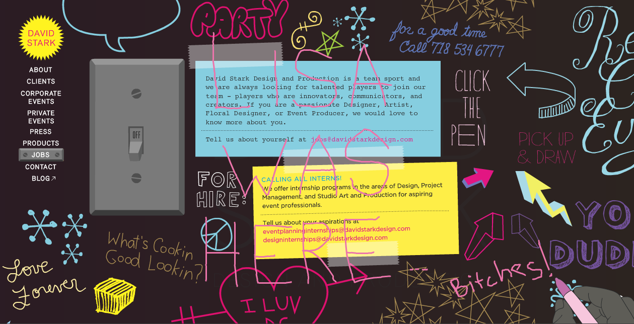
DSD is an artistic events design company. The website has one sidebar with navigation, but every page has a unique form of interaction. I took some screenshots to hopefully convey some of the fun one can have on this site.


DSD is an artistic events design company. The website has one sidebar with navigation, but every page has a unique form of interaction. I took some screenshots to hopefully convey some of the fun one can have on this site.


Studio Condition Portraits
General Bright Wash

With Flash

Red Lampshade and Fabric over the Light

Side Lighting Only


With Flash

Red Lampshade and Fabric over the Light

Side Lighting Only


Tuesday, July 5, 2011

TIAA-CREF Logo Redesign
TIAA-CREF: Teachers Insurance and Annuity Association - College Retirement Equities Fund

"TIAA-CREF is a Fortune 100 financial services company and leading provider of retirement benefits nationwide."
Core Values/Goals and Target Market:
-- Provide financial security through a personal approach
-- Believe in socially responsible investing
-- TIAA-CREF started as a financial services company for university professors. Though this market accounts for the majority of its clientele, TIAA-CREF is open to companies and individuals throughout the nonprofit world
Logo Critique:
-- Though TIAA-CREF is by definition a financial company, the logo remains too stark. It lacks the personality associated with nonprofits and the academia worlds.
Competitors:
-- Competition for TIAA-CREF can be categorized into financial security services for teachers, socially responsible services, and companies targeting teachers. The logos for companies in the first two categories are very simple, straightforward, and a bit boring. The logos for companies in the last category are too juvenile to be taken seriously.


For the redesign, I wanted to introduce a human element into the logo to reflect TIAA-CREF's affiliation with academia while remaining true to the fact that it is fundamentally a financial company. The teaching theme is highlighted by the apple cradled in the person's hand and the four lines referring to writing on the chalkboard. I pulled colors from the TIAA-CREF website, choosing the dark blue as a cool and trustful representation of the financial world, and the orange as a more progressive and modern alternative to the lighter blue from the original logo.

I added the triangle in this version for both thematic and aesthetic reasons. The angle of the triangle ambiguously represents an open horizon or thought bubble. Additionally, its white background helps the letters stand out more.

Subscribe to:
Posts (Atom)