Tuesday, July 19, 2011

Unconventional Photo Sizes


Artist's Statement

At my core lies the concept of blending artistic forms in creating communicative experiences. I have found that though each art form communicates a thought or concept in its own right, it is when diverse forms combine in expressing a common goal that communication reaches new heights. In this harmonious spirit, I am building LaRK Productions, an interdisciplinary art production company that unites artists in communicative installations or events.

As an individual artist, my main form of communication is dance. I find the human form the fundamental creator and communicator, and use the body as my primary material for my art. Themes in my work vary from fantastical narratives to exploring relationships, but always maintain a particular purpose. When choreographing a piece, I am constantly looking for inspiration in music, literature, and my own experiences to add layers to my work.

As a producer with LaRK, I look to present stories and opinions from the perspective of different artists. I join choreographers and graphic artists, writers with fashion designers in producing these interdisciplinary experiences. Additionally, in many LaRK projects, I appeal to the audience to interact or participate with the art to encourage more communication.

Wednesday, July 13, 2011

Unconventional Website Navigation

David Stark Design

DSD is an artistic events design company. The website has one sidebar with navigation, but every page has a unique form of interaction. I took some screenshots to hopefully convey some of the fun one can have on this site.


Studio Condition Portraits

General Bright Wash


With Flash


Red Lampshade and Fabric over the Light


Side Lighting Only


Tuesday, July 5, 2011

LaRK Logo

TIAA-CREF Logo Redesign


TIAA-CREF: Teachers Insurance and Annuity Association - College Retirement Equities Fund


"TIAA-CREF is a Fortune 100 financial services company and leading provider of retirement benefits nationwide."

Core Values/Goals and Target Market:
-- Provide financial security through a personal approach
-- Believe in socially responsible investing
-- TIAA-CREF started as a financial services company for university professors. Though this market accounts for the majority of its clientele, TIAA-CREF is open to companies and individuals throughout the nonprofit world

Logo Critique:
-- Though TIAA-CREF is by definition a financial company, the logo remains too stark. It lacks the personality associated with nonprofits and the academia worlds.

Competitors:
-- Competition for TIAA-CREF can be categorized into financial security services for teachers, socially responsible services, and companies targeting teachers. The logos for companies in the first two categories are very simple, straightforward, and a bit boring. The logos for companies in the last category are too juvenile to be taken seriously.


For the redesign, I wanted to introduce a human element into the logo to reflect TIAA-CREF's affiliation with academia while remaining true to the fact that it is fundamentally a financial company. The teaching theme is highlighted by the apple cradled in the person's hand and the four lines referring to writing on the chalkboard. I pulled colors from the TIAA-CREF website, choosing the dark blue as a cool and trustful representation of the financial world, and the orange as a more progressive and modern alternative to the lighter blue from the original logo.

I added the triangle in this version for both thematic and aesthetic reasons. The angle of the triangle ambiguously represents an open horizon or thought bubble. Additionally, its white background helps the letters stand out more.

Tuesday, June 14, 2011

Color - Texture - Pattern Photoshoot

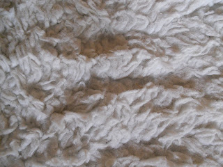
For this first photoshoot, I decided to particularly explore the idea of texture. I took close-up shots of various items in my home to really emphasize their materials.


1. Shag carpet -- the folds are just from people walking on it; no extra fluffing.


2. Section of a painting, red flowers -- the artist herself already plays with texture in incorporating light and shadow into the bouquet; the globs of paint then add a 3D effect too.


3. Corner of a brick wall -- focus is not the best, but I still find the text of the bricks interesting.


4. Dot Decal -- the texture of the white wall shows through the added dot decal. People confuse the decal for paint because of this texture.


5. Bejeweled Headband -- rhinestones, ribbons, beads, pearls, etc play with and off each other against the white satin background. The contrast in materials provides a nice stimulus within the shape of the heart.